Hey everyone, Raquel Bowman here today with my first post with Hip Kit Club. I am SO excited to be here and contributing to this team! You will be able to find my posts on the blog every second Friday 🙂
Today I am here to share a 12×12 layout that I created using the October Main Kit and the October 2015 Cut File designed by Ashley Horton. 
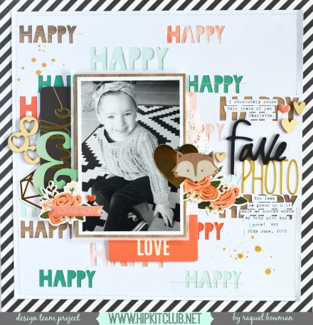
 Here is what I created:
Want to create layouts like this? Our monthly kits include coordinated papers, embellishments, and supplies to bring your scrapbook pages to life.
I had wanted to scrapbook this photo of my daughter ever since I took it. I just could not believe how grown up she looks in this picture considering she is only 2 and a half years old here. I loved the cut file by Ashley, however, the ‘fall’ theme did not suit my picture. So I decided to open up my Silhouette software and delete any of the ‘FALL Y’ALL’ words. This left me with a staggered ‘happy’ cut file background which I am really happy with.
To add a bit of detail and interest to this cut file background I chose a few of the papers in the Main Kit and used those to back the words. I aimed to have a scattering of the green/emerald, coral and woodgrain patterns amongst the paper. This not only helps the words pop, but also gives a sense of balance without making the layout feel too busy.
I also decided to back the paper onto the beautiful black and white diagonal ‘Ribbon Stripe’ paper from Jen Hadfield. I think this pop of black and white tied the embellishments I added to the page beautifully and gave it a nice frame considering that it was a little busy from the cut file background. I machine stitched around the edge to add further detail and added machine stitching through a few of the ‘happy’ die cut words on the page.
I decided to stick with the main only for this layout to demonstrate what can be created by using it only. Plus, there is so much in the kit I certainly didn’t have to go looking for more embellishments! I used the Jen Hadfield ephemera pack from the kit to embellish the layout. I layered a 3×4″ card, a polaroid style frame and other elements like flowers and hearts to create clusters to the left and right of the photo.
I had a bit of trouble choosing where to place the title as I didn’t want it to become lost amongst the background. In the end I chose the negative space on the back ground to the right of the photo to embellish. The word fave from the Dear Lizzy phrase thickers and the gorgeous gold alphas were a perfect combination on this page. I love the contrast the pops of black add.
I do not know where I would be without my trusty typewriter. My in-laws managed to pick one up for me in an local antique stall for only $30 Aussie Dollars which is a pretty good deal. And the bonus is, it is aqua in colour! I think I use it to journal on pretty much every page. I love the look of typewritten journaling and it is just a super quick, efficient way to get my story onto paper and onto my layouts. I also love that when I go on a crop I can take it along with me without it being to bulky.
I finished the pack with a splattering of Heidi Swapp Colorshine in Gold Lame. I didn’t want the splatters to effect my photo or my journaling so I made sure to cover both with scraps of paper.
I hope I have been able to inspire you with my first share to the Hip Kit Club blog. I can’t wait to share what else I have been creating using the kits with you all!
Raquel xxx
Grab This Month's Kit
Every month we put together a box of coordinated papers, embellishments, and supplies that all work together. Open the box, start creating. It's that simple.


